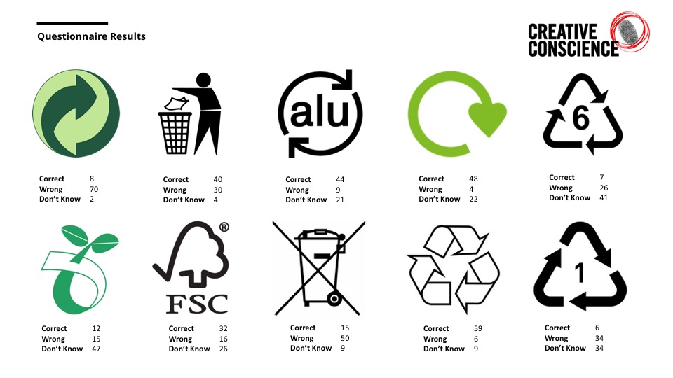
As another further set of research, released a public survey asking people the meaning to 10 different symbols – all of which relate to recycling or the waste industry. The survey results weren’t overly shocking as I already understood that recycling and waste symbols are confusing, not just for myself but my friends, family and peers have agreed with this statement also. Below are the results of the survey and the symbols in which people were asked to identity. As shown here, most responses were wrong or the participants were unsure of the symbols meaning. This further supports my statement of recycling symbols being too confusing and there being a need for a universal system in place for everyone, globally to understand the disposal of their everyday materials.
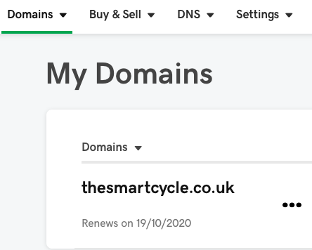
This week I brought the domain for my brand Smart Cycle. As there wasn’t a domain available with only ‘smart cycle’ in the title, I had to buy one using ‘thesmartcycle.co.uk’ although the brand name remains as ‘smart cycle’ without the ‘the’. I then redirected the domain to my hosting server were I could then build the website using WordPress. See below for domain manager screenshot.
Once I knew the name for my brand and the domain had been brought as a solidification for the brand name, I began to create several versions of the potential logo style and brand identity. Following on from my research into eco-branding, I decided to use a lighter weight on the typography in an attempt to reduce my ink consumption for when the logo is print and also used the CMYK guide to chose my main brand colour, this being the Smart Cycle Blue (75, 0, 25, 0), as seen listed in the guide under the blue section. I chose to use a blue colour as often blue and green are the associated colours with recycling and the greens provided on the guide were too light, which meant if I wanted a green logo that stood out, this wouldn’t allow me to reduce my ink consumption.
I went for a more tech looking approach for the logo as the project is based upon the advantage of technology in educating others about recycling and providing a quick service through modern technology. The arrows remained as a connection to the many recycling symbols that use them, but instead they have been used to form an S and C for Smart Cycle.
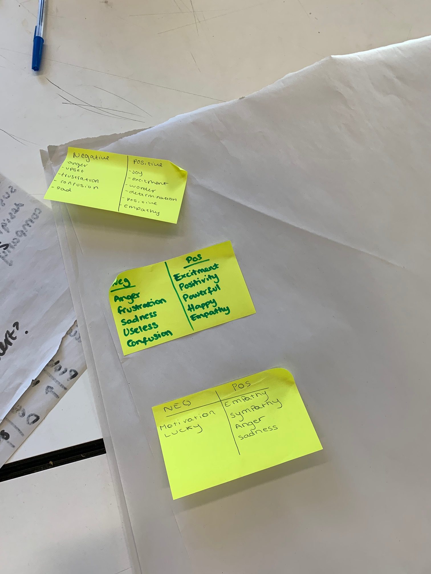
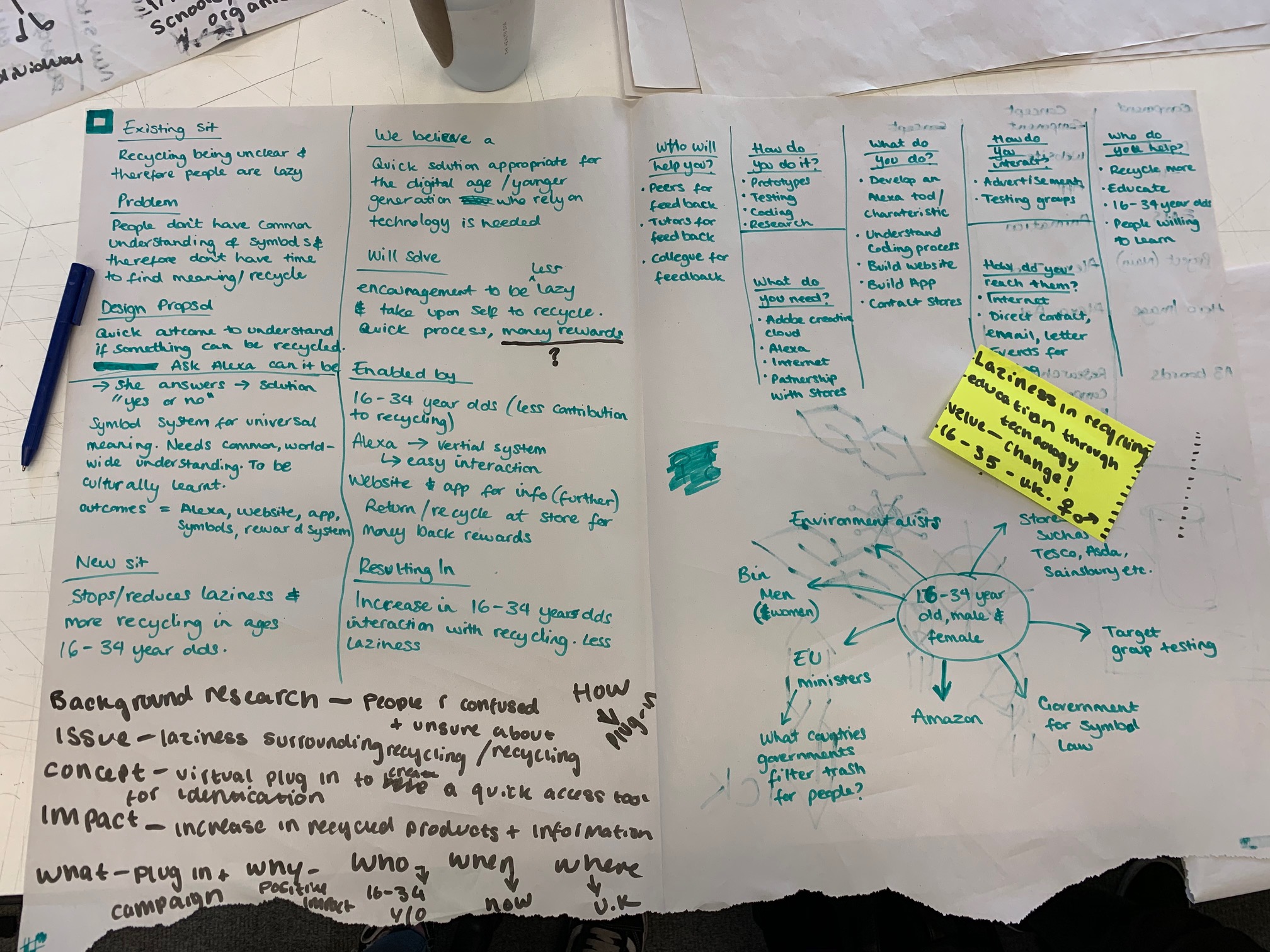
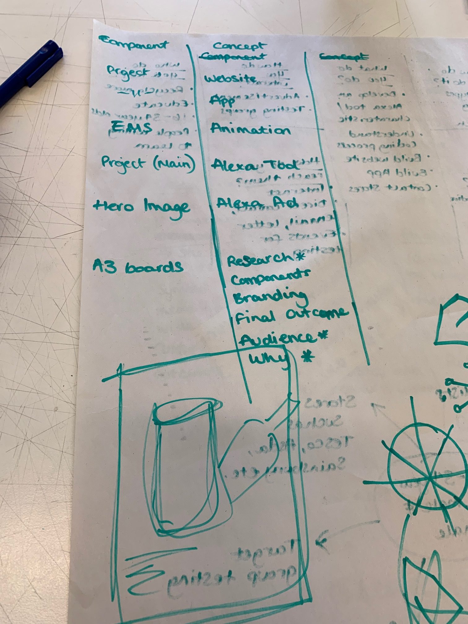
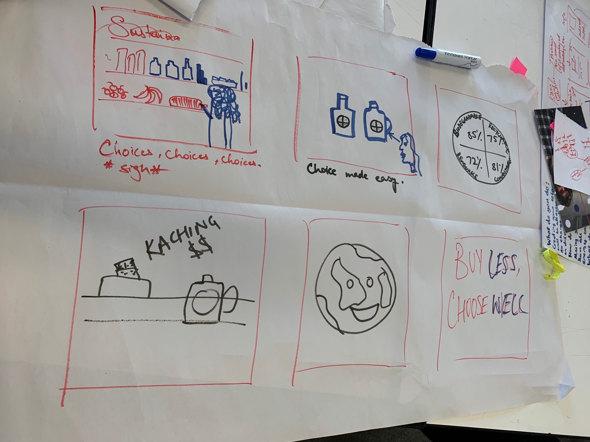
In the fifth week, my peers and I also took part in an all day workshop – a design jam. This workshop was designed to clear our minds and solidify our projects. This meant, understanding our projects in depth, being able to explain the issue, solution, purpose of the project and hopeful results, all alongside listening to music to help us flow. We worked in groups to evaluate our area of interest – conscious consumption – and the emotions, both positive and negative, that could be perceived through our projects / area of choice. We then, in groups, began to visualise one of our projects in order to understand its process and breakdown its purpose for further understanding of their project.
Workshop