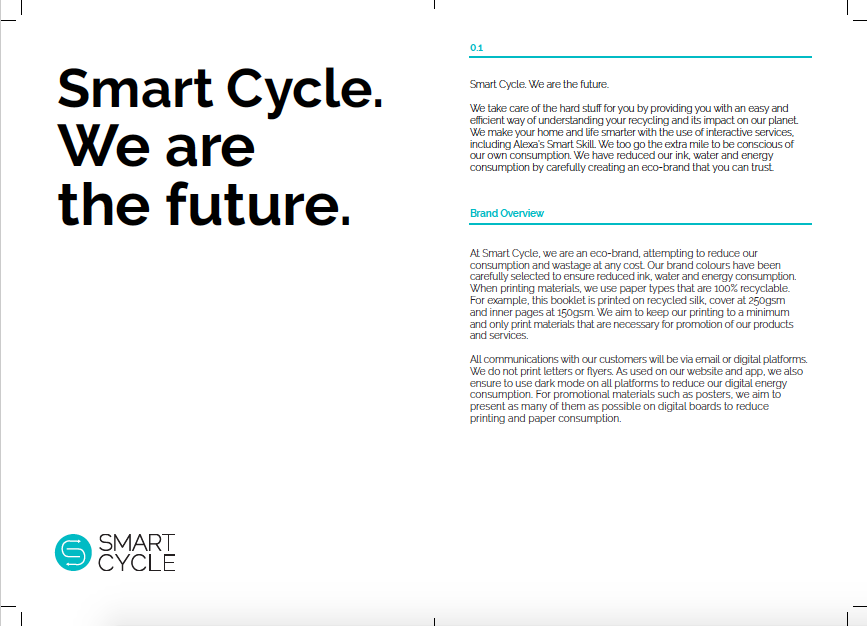
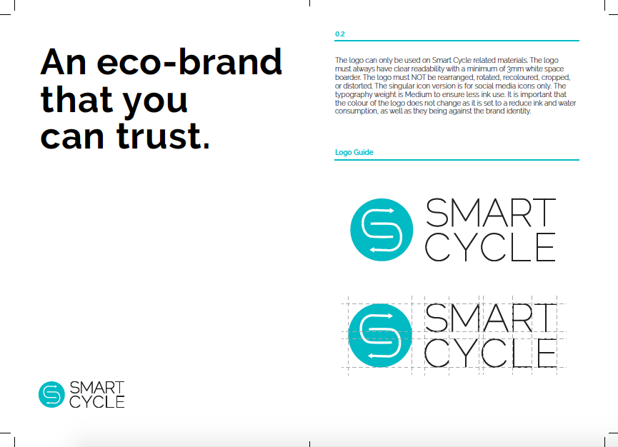
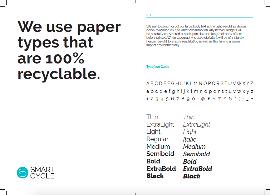
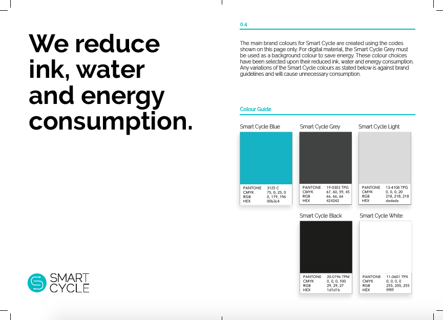
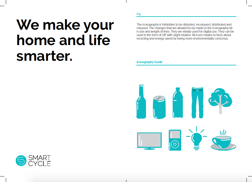
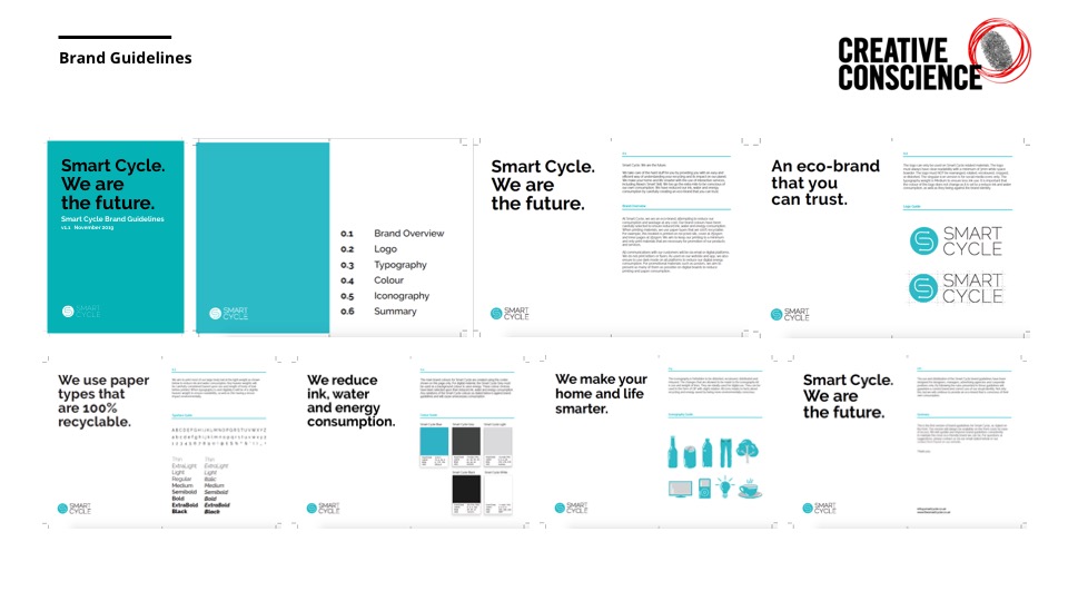
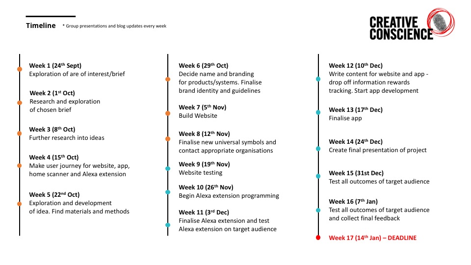
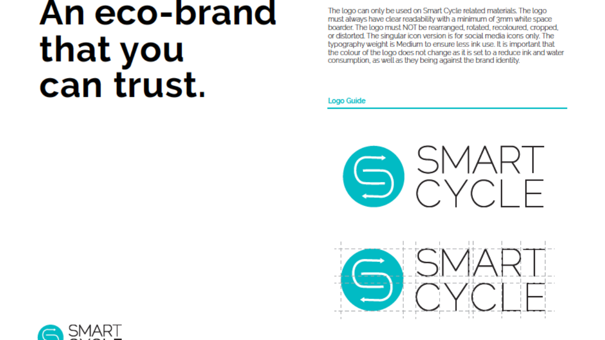
I have created brand guidelines to explain the rules for the logo, typography, colours, icons, hero image and brand overview. The main focus of the brand guidelines is enforcing an eco-brand. In order to reduce our ink, water and energy consumption by carefully creating an eco-brand that can be trusted. The brand guidelines have been printed on recycled paper. It is important that the brand maintains a reduced carbon footprint and therefore, ensure to keep printed materials to a minimum. The brand guidelines are to instruct the use of the brand and how to maintain a substantial and sustainable approach throughout.
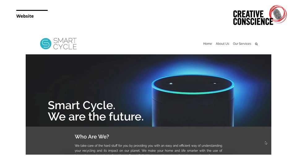
This week I presented to one of my tutors and my peers again. They were pleased with the progression of the project and all agree that Alexa works well thus far. The feedback that I received was to begin creating designs for the codes and how they will be incorporated into the packaging of other brands. This is something I will be reviewing in the next few weeks. As well as this, I was asked how I thought the website could be more fun and engaging as of current it is text based and almost an overwhelming amount of information.
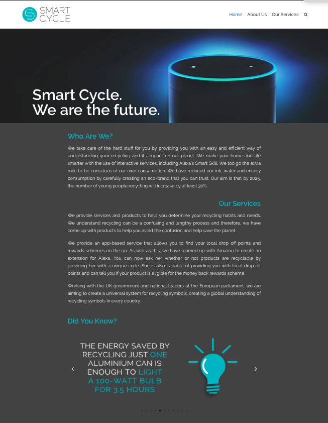
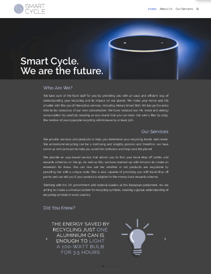
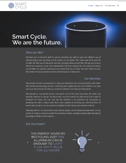
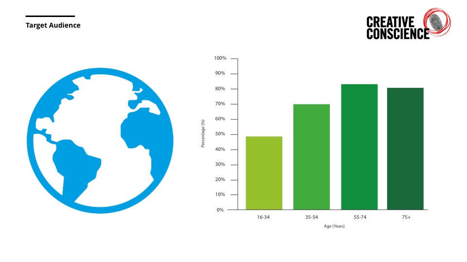
I have begun by testing the website further in order to understand the best utilisation of its elements and functions. I have considered new ways of making it more engaging and fun by adding new elements that might be of interest to my target audience. Another element of the website that is important is understanding whether my brand and digital platforms are available to everyone, I have tested whether the website functions well for those who are colour blind by testing how the colours and layout etc would be seen by themselves.
