fact-5

Week Six – 29th October 2019

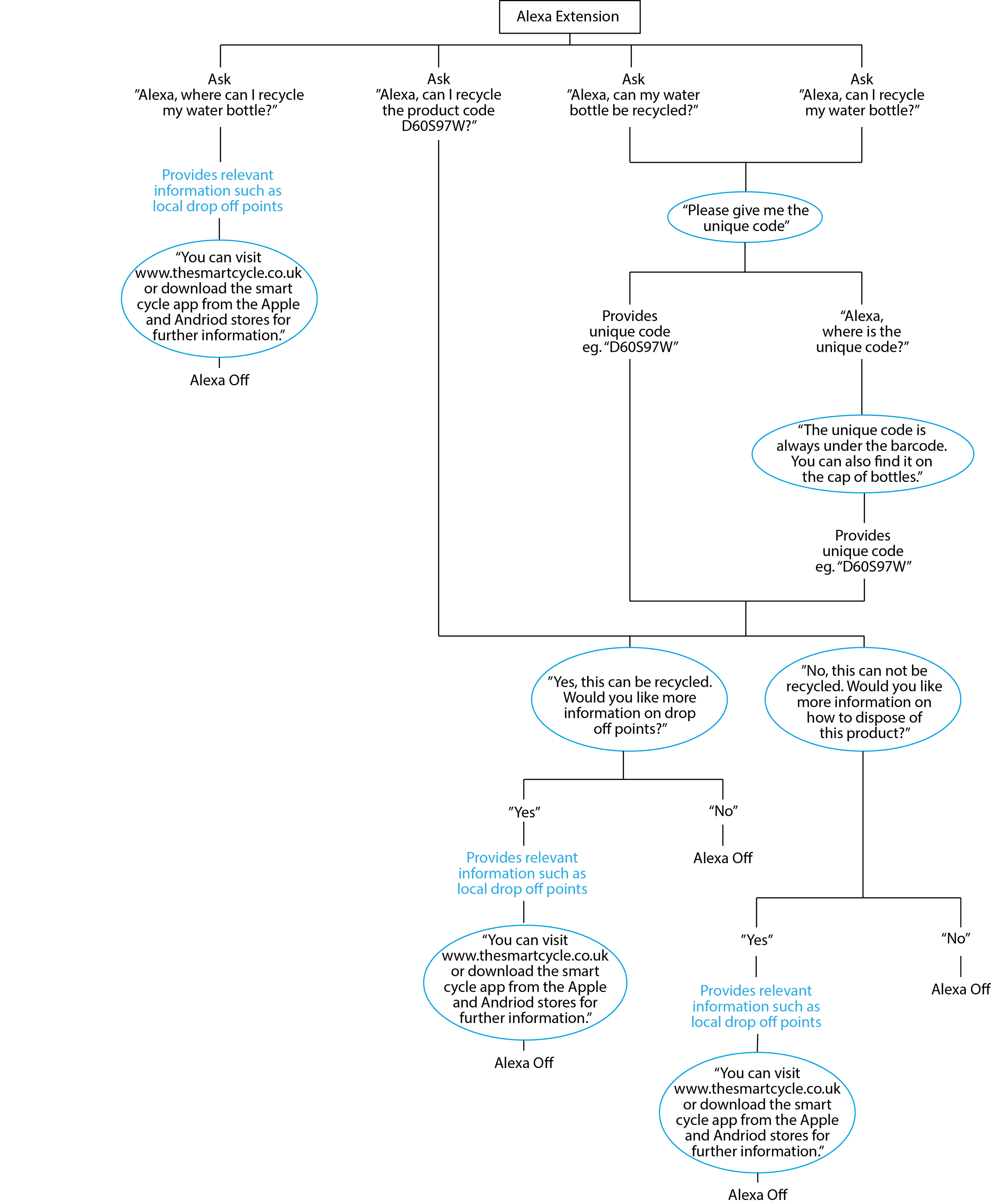
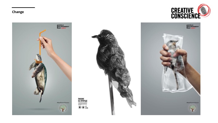
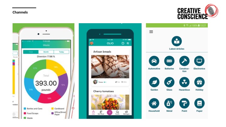
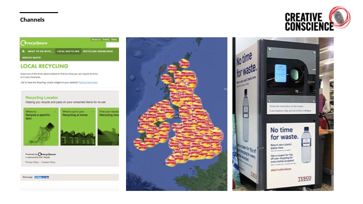
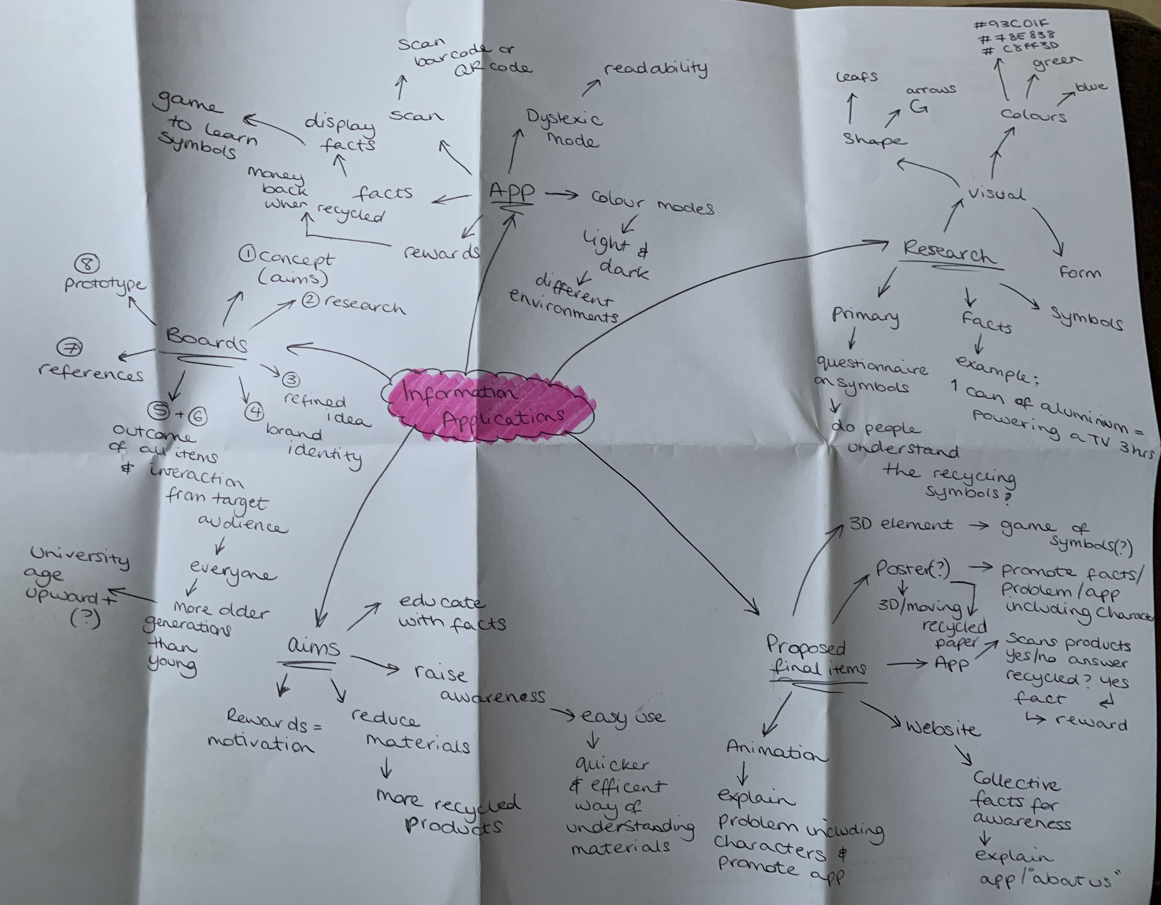
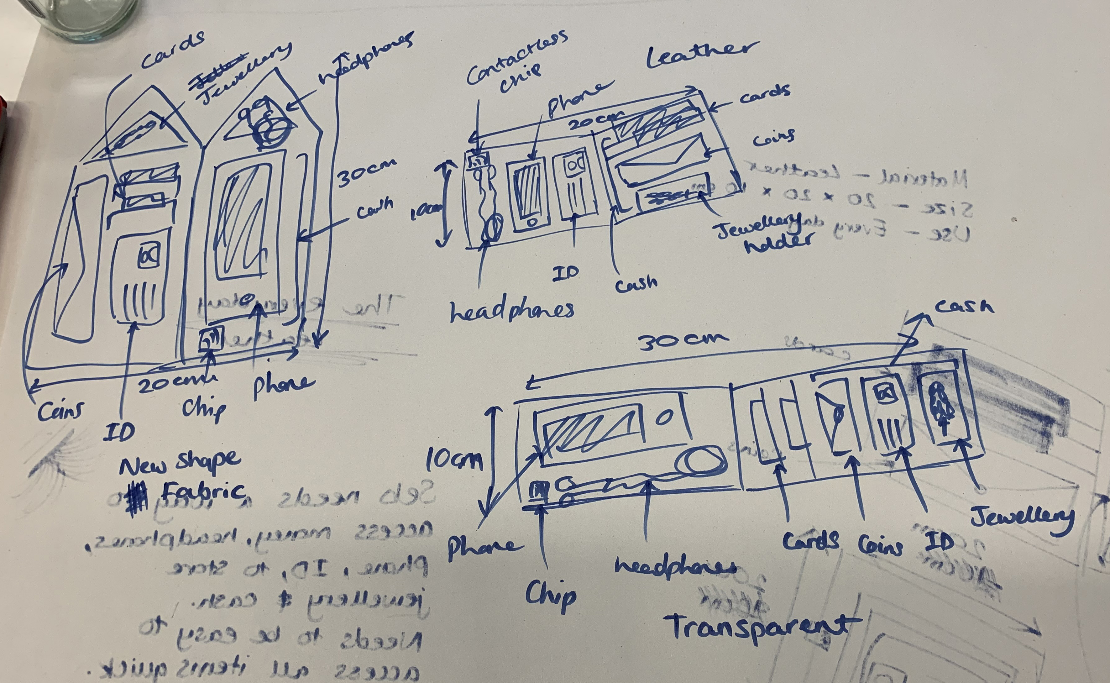
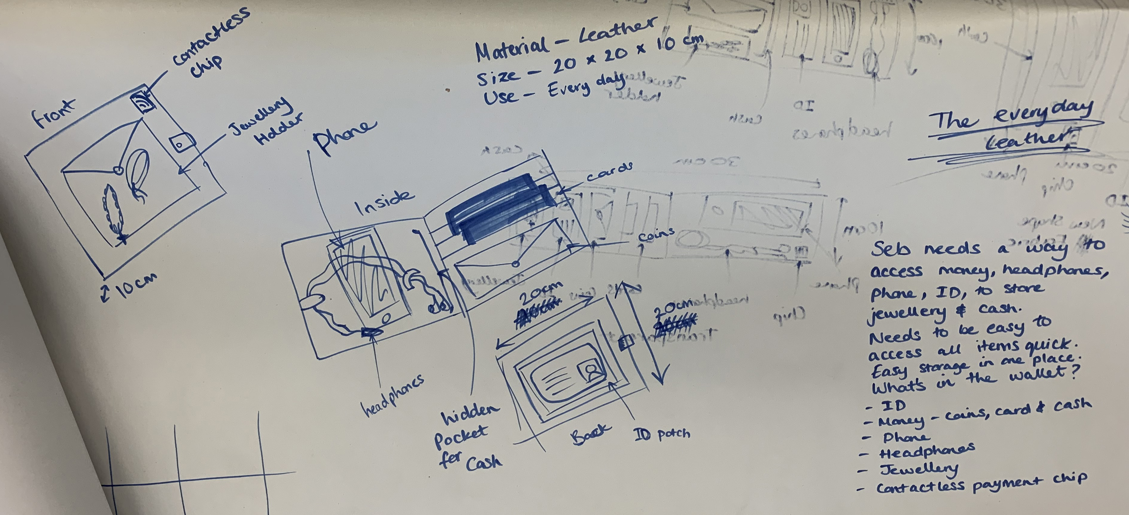
In this week’s blog, I want to clarify some terminology in which I will be using throughout the process of creating the interaction with Amazon Alexa. All the below definitions are important in understanding the creation process of bringing the collaboration between Alexa and Smart Cycle alive. I have also started by creating a user journey for Alexa as shown below.

Alexa Skill Development / Alexa Skills Kit – software development kit that enables a developer to build skills for Amazon Alexa artificial intelligence assistant.

Intent – An intent represents an action that fulfills a user’s spoken request.

Utterance – Utterances are the specific phrases that people will use when making a request to Alexa. For example, “What time is it?”

Slots – A slot is a variable that relates to an intent allowing Alexa to understand information about the request.

VUI – Voice User Interface – A VUI is more sophisticated than an interactive voice response (IVR) system. 

Ableism – discrimination in favour of able-bodied people.

Search Engine Optimisation – the practice of increasing the quantity and quality of traffic to your website.

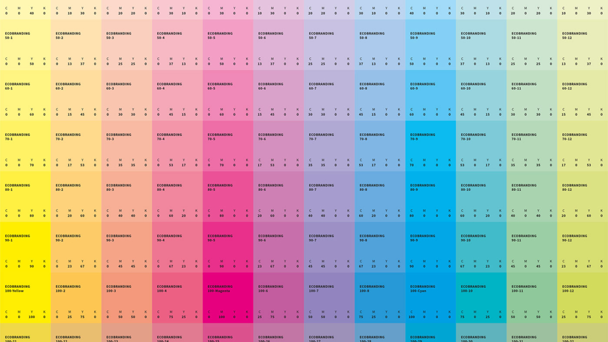
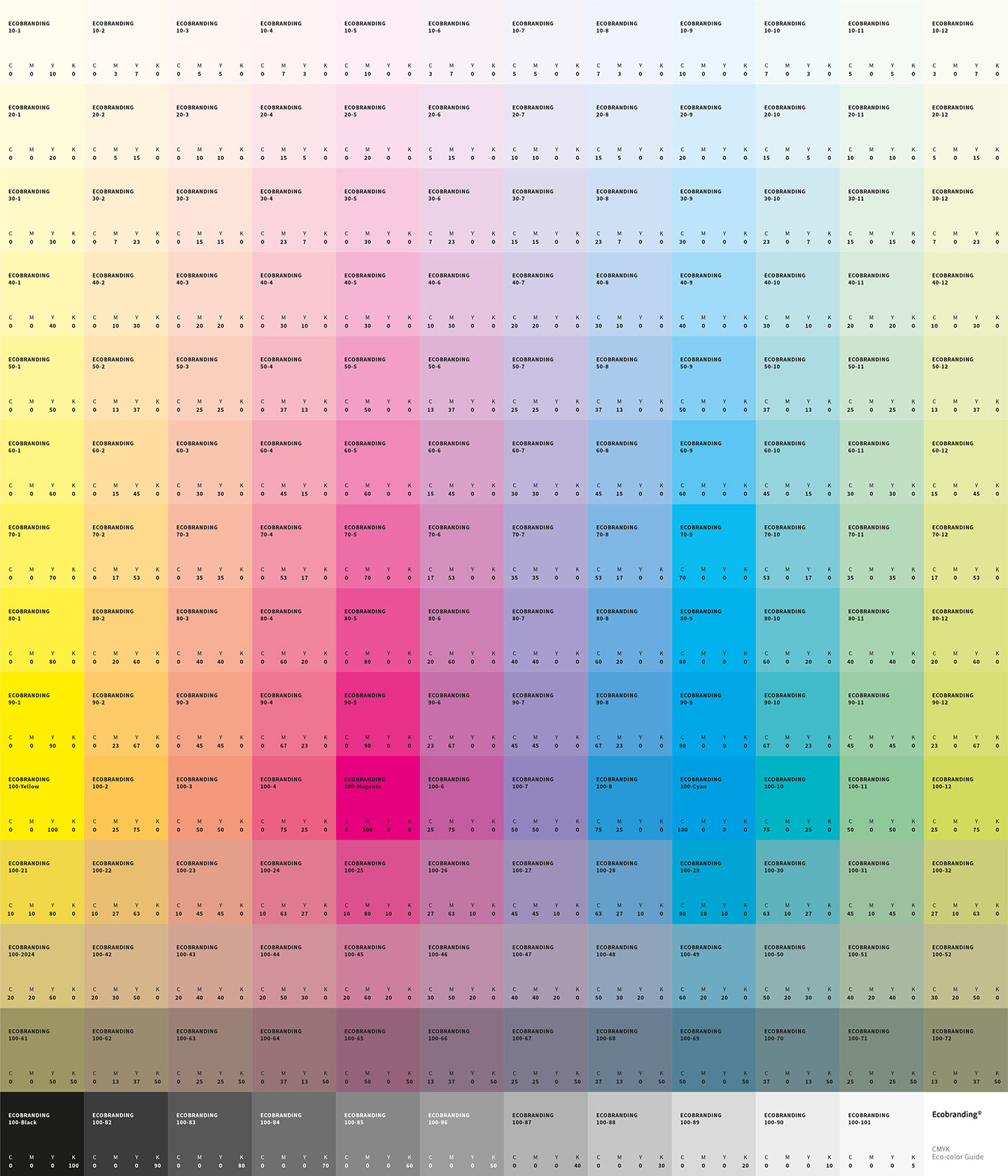
I am at a stage with the branding in which I have designed the logo, decided upon the colours and typography etc, that this allowed me to begin creating brand guidelines and a stylescape. This allows me to understand the overall aesthetic that I will be using throughout my project and can be applied straight away in area such as the website.

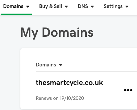
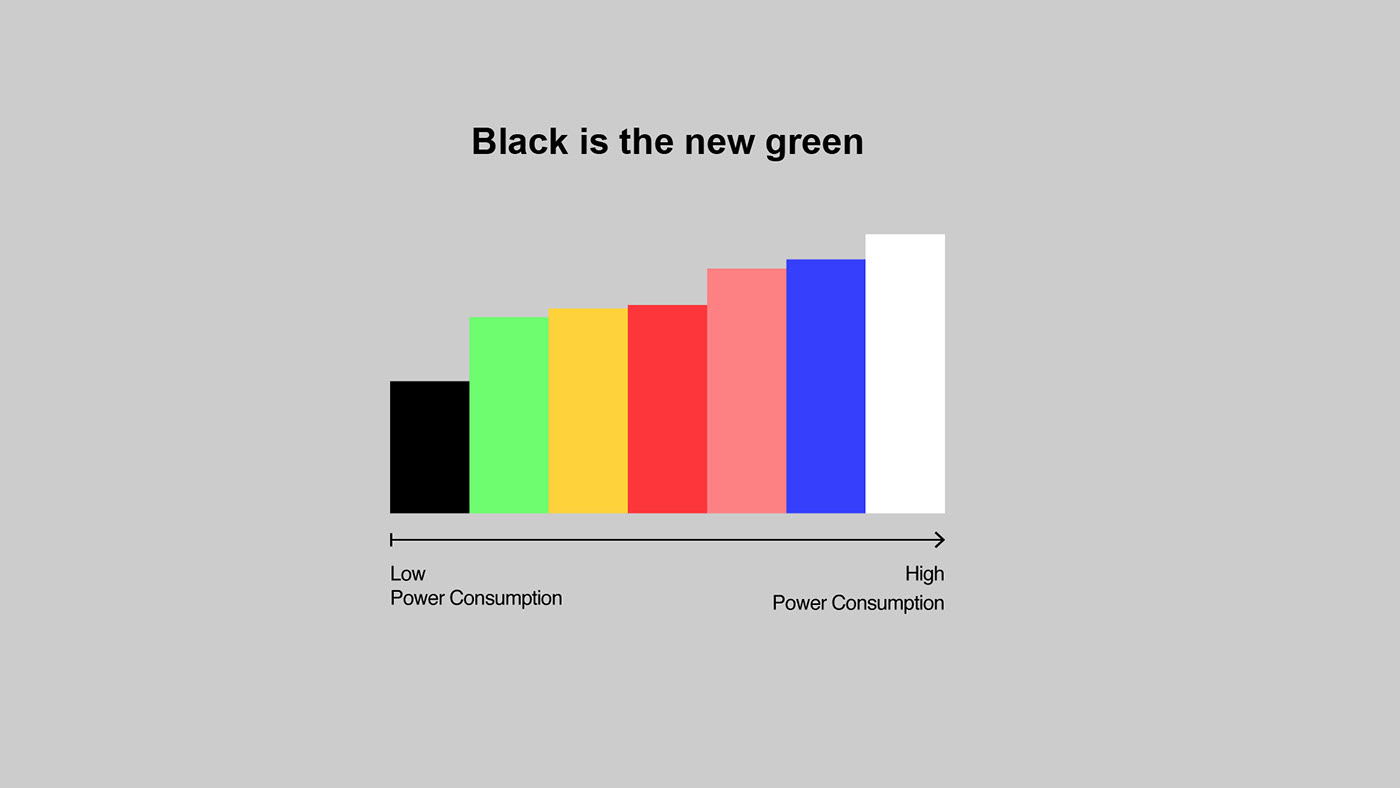
As mentioned in last week’s blog, I have brought the domain name ‘thesmartcycle.co.uk’. I then directed this domain towards my server and this allowed me to begin building the website using WordPress. I have got to the stage in which I had built the home page, including GIF and facts about recycling. From my research regarding the energy used for different colours per pixels, I found using darker themes will save energy. Therefore, I designed the home page to sit against a dark grey background to be more efficient than a white background.

As well as this, I built the pages of ‘our services’ and ‘about us’ which meant I also needed to write content for these pages. From this, I wrote the mission statement, ready to apply into the ‘about us’ page. The mission statement focuses on the purpose of my project, its aims and the issue in which I am tackling with this project. I plan to write the remaining content for the website within the following week.

Alexa User Journey
GIF Example
Website Homepage
Fact Examples on Website
Smart Cycle Iconography
LOGO

Week Five – 22nd October 2019


As another further set of research, released a public survey asking people the meaning to 10 different symbols – all of which relate to recycling or the waste industry. The survey results weren’t overly shocking as I already understood that recycling and waste symbols are confusing, not just for myself but my friends, family and peers have agreed with this statement also. Below are the results of the survey and the symbols in which people were asked to identity. As shown here, most responses were wrong or the participants were unsure of the symbols meaning. This further supports my statement of recycling symbols being too confusing and there being a need for a universal system in place for everyone, globally to understand the disposal of their everyday materials.

This week I brought the domain for my brand Smart Cycle. As there wasn’t a domain available with only ‘smart cycle’ in the title, I had to buy one using ‘thesmartcycle.co.uk’ although the brand name remains as ‘smart cycle’ without the ‘the’. I then redirected the domain to my hosting server were I could then build the website using WordPress. See below for domain manager screenshot.

Once I knew the name for my brand and the domain had been brought as a solidification for the brand name, I began to create several versions of the potential logo style and brand identity. Following on from my research into eco-branding, I decided to use a lighter weight on the typography in an attempt to reduce my ink consumption for when the logo is print and also used the CMYK guide to chose my main brand colour, this being the Smart Cycle Blue (75, 0, 25, 0), as seen listed in the guide under the blue section. I chose to use a blue colour as often blue and green are the associated colours with recycling and the greens provided on the guide were too light, which meant if I wanted a green logo that stood out, this wouldn’t allow me to reduce my ink consumption.

I went for a more tech looking approach for the logo as the project is based upon the advantage of technology in educating others about recycling and providing a quick service through modern technology. The arrows remained as a connection to the many recycling symbols that use them, but instead they have been used to form an S and C for Smart Cycle.

In the fifth week, my peers and I also took part in an all day workshop – a design jam. This workshop was designed to clear our minds and solidify our projects. This meant, understanding our projects in depth, being able to explain the issue, solution, purpose of the project and hopeful results, all alongside listening to music to help us flow. We worked in groups to evaluate our area of interest – conscious consumption – and the emotions, both positive and negative, that could be perceived through our projects / area of choice. We then, in groups, began to visualise one of our projects in order to understand its process and breakdown its purpose for further understanding of their project.

Workshop

Survey Results
Smart Cycle Domain
Other Potential Logos
Smart Cycle Official Logo
Workshop – Emotions from our projects
Workshop – Understanding your project
Workshop – Component Breakdown
Workshop – Peer’s Story board
375a1386100131.5d9087f7784d3

Week Four – 15th October 2019

Research, Research, Research!

This week I have been focusing on researching beyond my project and issue at hand and looking further into eco-branding and other way in which to help save energy and the environment. But first, I refined my target audience to 16-34 years old (male and female) as a study found that millennials are the least likely to contribute to recycling with only 49% admitting they recycle. Link to study – therecycler.com/posts/research-reveals-millennials-worst-at-recycling/

I discovered how graphic design contributes towards the climate crisis in choice of materials and design aesthetic. This lead me down the path of understanding how ink and print based designs can impact the same way as us individually not contribution to recycling.

I found a eco-branding CMYK print guide. This guide provides you with codes of all colours at different shades that use less ink than randomly selecting a colour, with any CMYK code. For example, red colours use more ink to be printed than black. Therefore, this guide has been created to limit the ink consumption used in four colour printing. The guide can be seen below and also through this link – github.com/Ecobranding/Ecobranding-CMYK-Guide

I also found examples of how to create a brand identity using less ink and water consumption. I found an eco-branding series showing popular, well known logos being rebranded for the purpose of less ink. Some examples of this can be seen below, clearly stating how much ink has been reduced using the new eco-logo styles. The series can be found on this link too – behance.net/gallery/56398071/ECOBRANDING-Eco-Logos?tracking_source=search%7Cecobranding

The further I looked into eco-branding the more I began to learn and understand about the ways a designer can consciously change their designs to better impact the world. This means, not only am I work towards a project to make others more conscious of their consumption, but us too as designers need to be aware of our own impacts.

I have found that the use of digital design with darker pixels as apposed to white pixels, uses less energy and battery. It is also more effective to use lighter text and iconography against darker backgrounds. This is an element of eco-branding I will consider when building my digital aspects such as website, app and moving image poster etc. Link to example built around these facts/finds – ecobranding-design.com/friendlui/

Millennials are the worst at recycling
Eco-Branding CMYK Guide – Reducing Ink Consumption
Eco-Branding | Eco-Logos – Reducing Ink and Water Consumption
Eco-Branding Digital – Black pixels consumes less energy than white pixels
Slide2

Week Three – 8th October 2019

Today I presented my ideas to my provided group, including other peers wishing to create solutions for conscious consumption and platform for joy. This is a useful group to be included within as they understand my research process and can contribute towards my approach by advising and informing me on other research areas that may relate to my idea. I included on slide 2, an interactive activity with my group to see how well people know some recycling symbols. Unfortunately, the symbols used for recycling are unclear and most people therefore get confused about what they are supposed to do. I received feedback from both my tutor and peers which was very useful in progressing in the right direction. I have been asked to refine my target audience as they are currently unsure. As my final outcome is not yet cemented, this is something I need to decide alongside the direction of my idea. My ideas are now being refined.

Presentation Slides

Slide 1
Slide 2
Slide 3
Slide 4
Slide 5
Slide 6
Slide 7
Slide 8
Slide 9

Week Two – 1st October 2019

As seen below, I have created a mind map in order to breakdown all the ideas and solutions I have thought of thus far. I have thought about the main aims, outcomes, research, target audience, etc. This mind map helped me to visualise my ideas and come up with a proposal to put forward to my tutors in order for them to gain further insight and understanding to my potential solution. We were also asked to carry out an exercise with a partner. This partner being a peer whom you feel you know least. We were asked to create wallet or handbag to represent and follow the individuals wants and needs. As I was working with a male peer, I created a wallet and was challenged with listening to my client and adapt for his needs. This exercise allowed me to develop the concept of adaptation to designs and working around the clients requirements which working with form and function together. 

Mind Map

Personal Idea Mind Map

Exercise

Three finalised wallet concepts
Notes of peers asked requirements, size and material

Research Collages

Week One – 24th September 2019

We began the day by having an introduction to the module, it’s aims and outcomes. We then ran through the briefs for further explanation and group discussions. Following this was an exploration of the briefs, placing us in groups where we picked a brief based on our shared area of interested and asked ourselves the questions of what’s the issue? What is the problem? How do we solve the issue/problem? Below are some of the works produced within my group, looking at conscious consumption as we all felt strongly about this topic. The other attached visuals are example of attempted solutions for conscious consumption – recycling specifically as I mostly have an interested in this area of the topic. This includes campaigns created to cause awareness of the affects that not contributing to recycling can have on our planet.

Questions that need answering

Wha’t are the problems to do with conscious consumption?
How do we solve these issues?

Research Collages