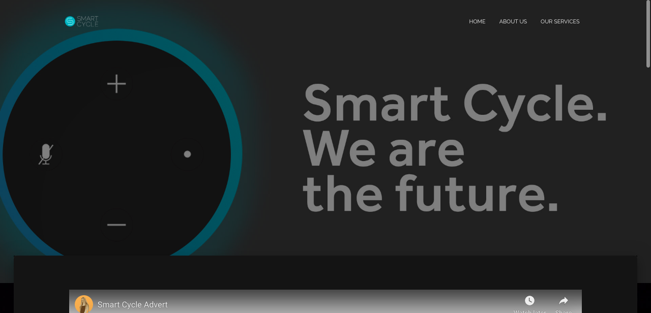
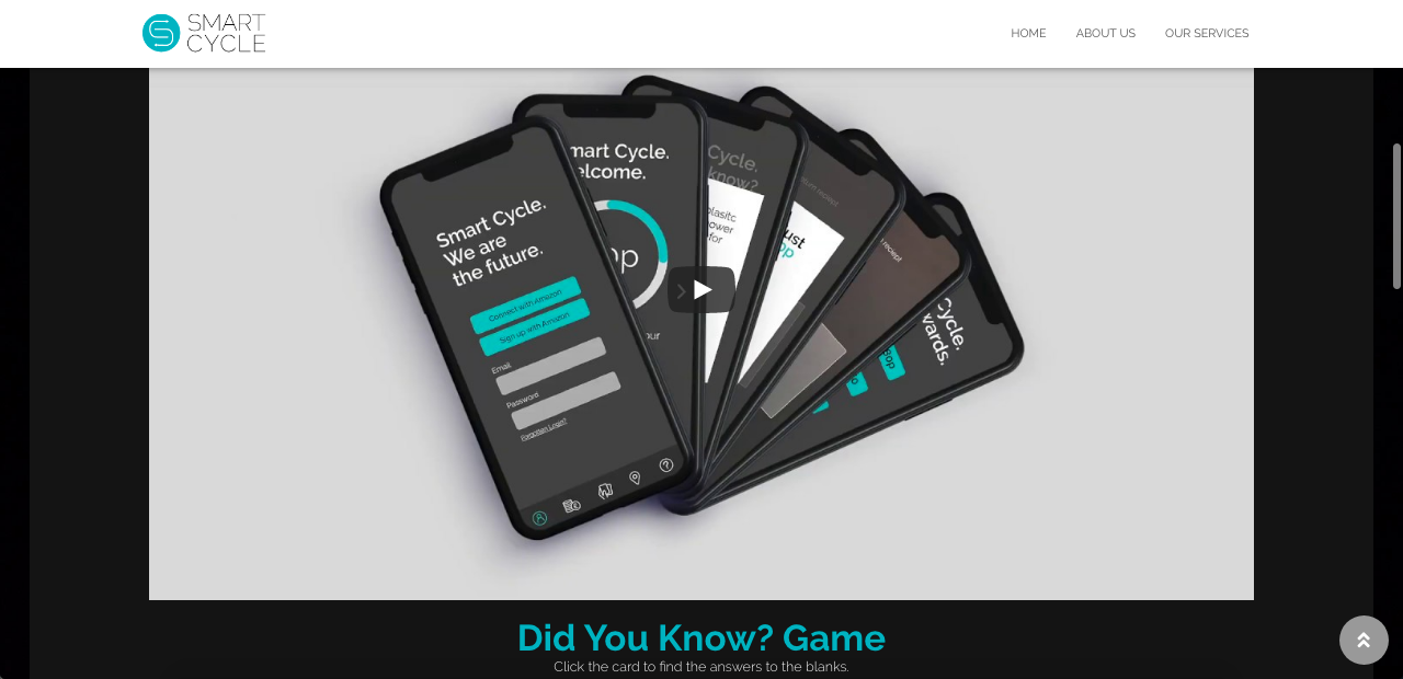
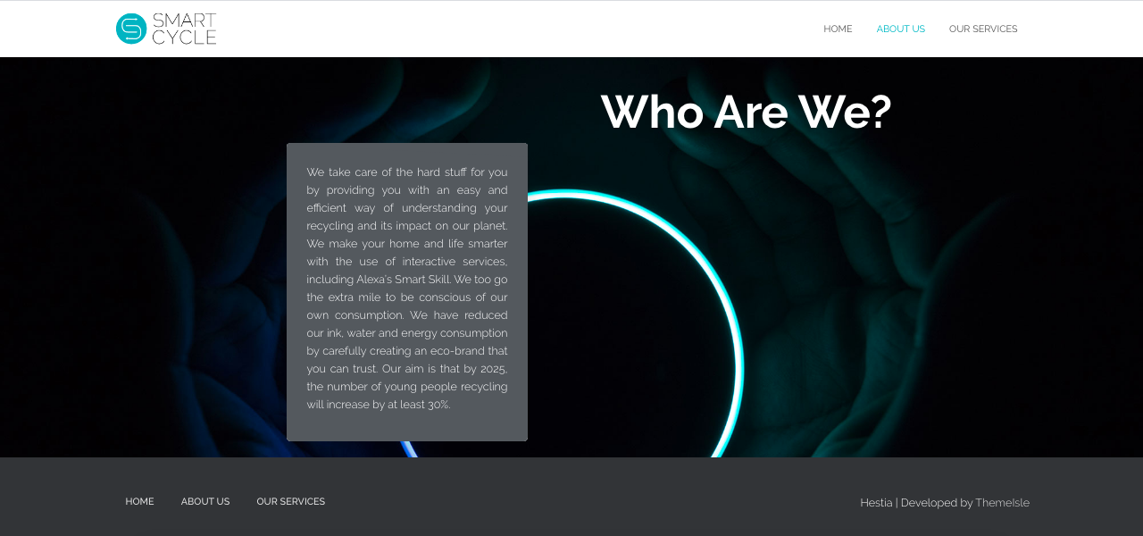
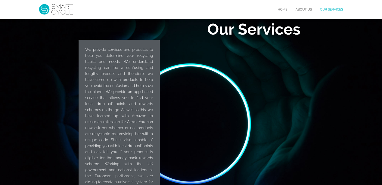
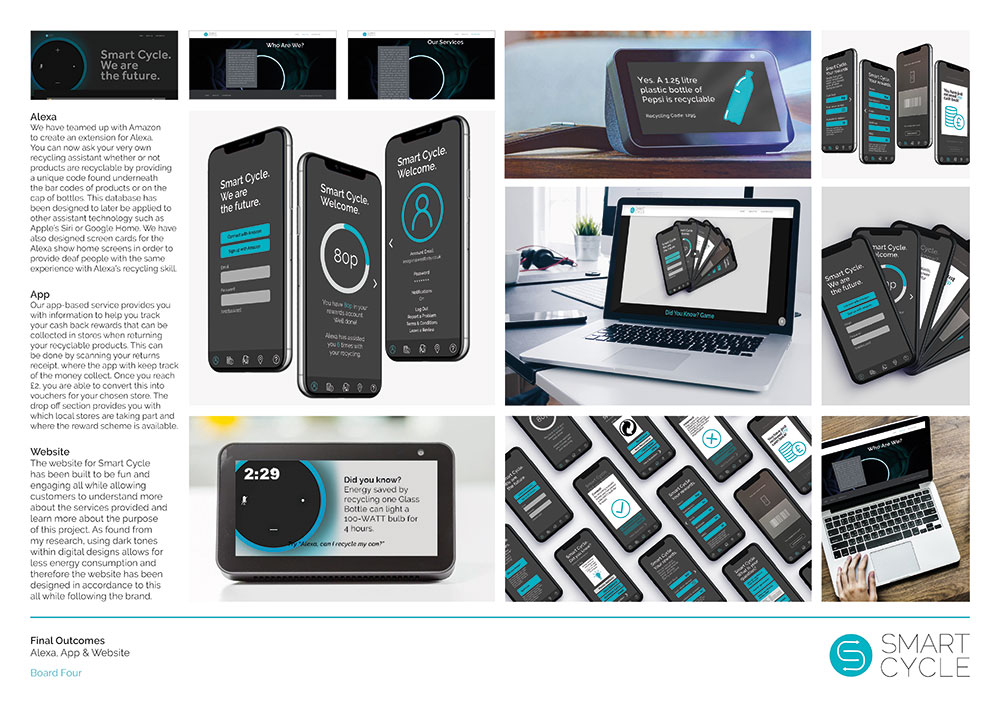
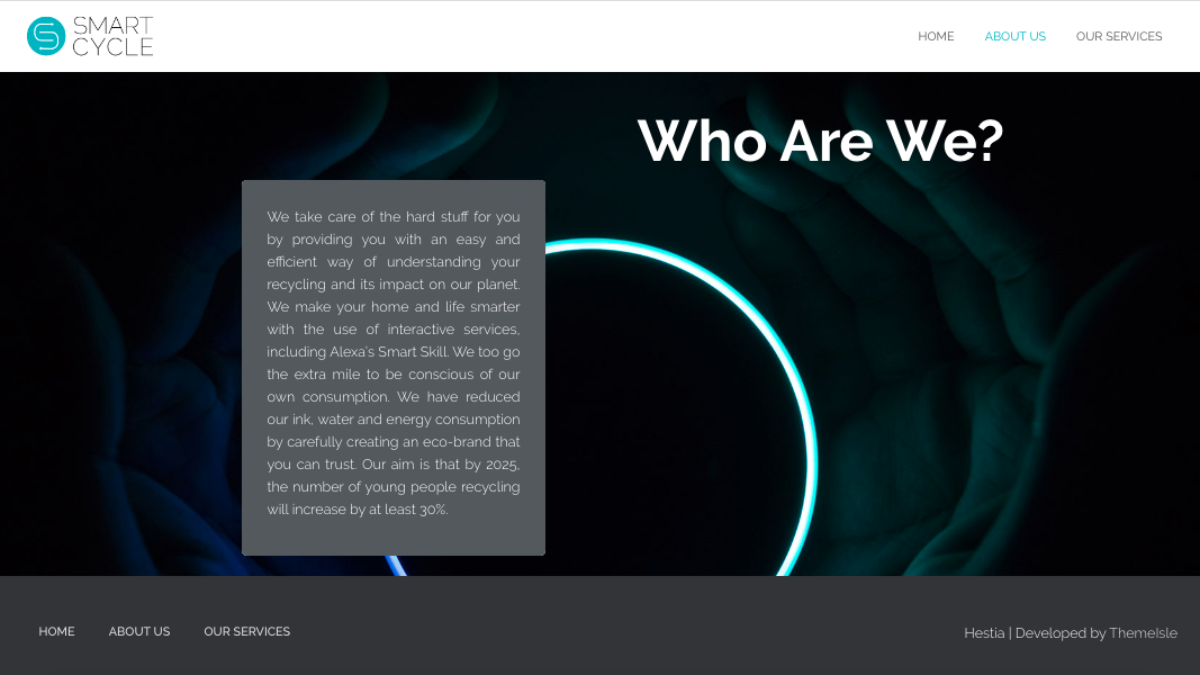
The website for Smart Cycle has been built to be fun and engaging all while allowing customers to understand more about the services provided and learn more about the purpose of this project. As found from my research, using dark tones within digital designs allows for less energy consumption and therefore the website has been designed in accordance to this all while following the brand and being engaging.
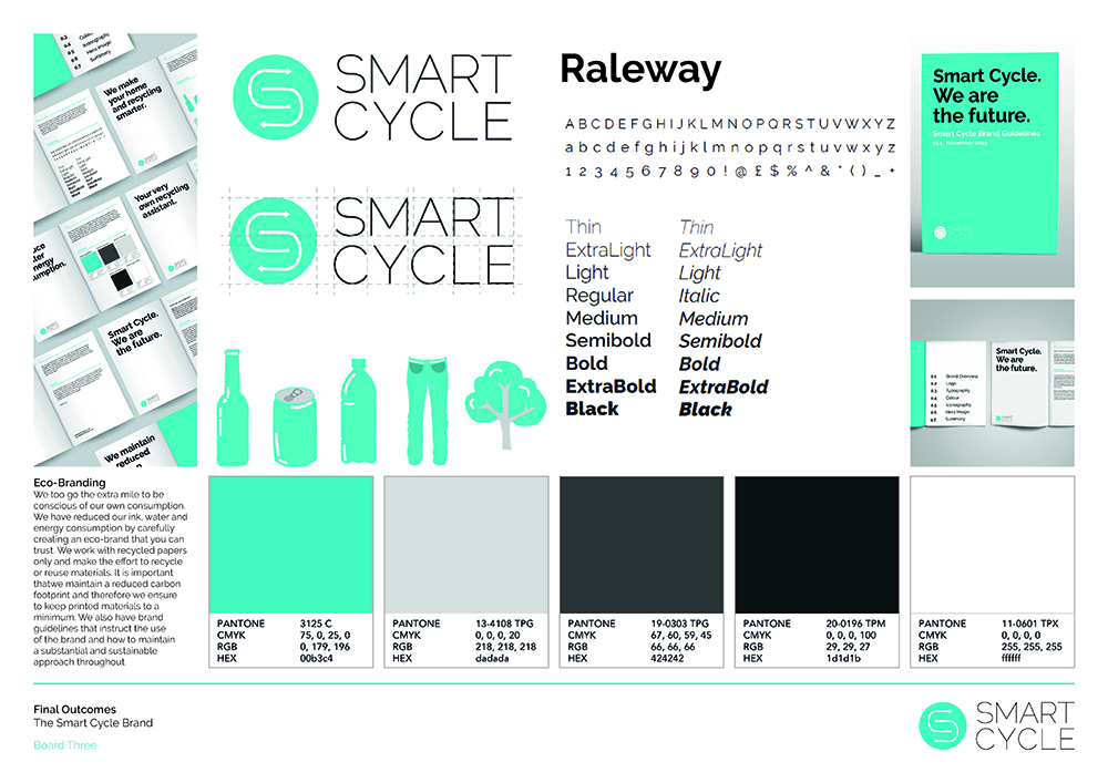
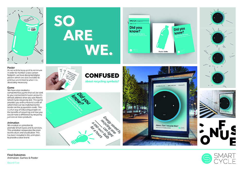
As all project outcomes are complete, I have finalised my A3 boards and sent them to be printed in time for submission. These boards include my project overview, explaining the issue, solution and target audience. I also covered on the boards, my research, all of the final outcomes and a user journey explaining how Alexa works and how the other outcomes work alongside this skill. For the boards I created a grid structure of 6 columns, of which any text (only of the board 20%) would be placed in the first column, in the bottom left corner, as found on all 7 boards. I have attempted to cover as much of the boards with visuals to communicate and pitch the project, as it was asked we focused on 80% visuals for this submission component.
